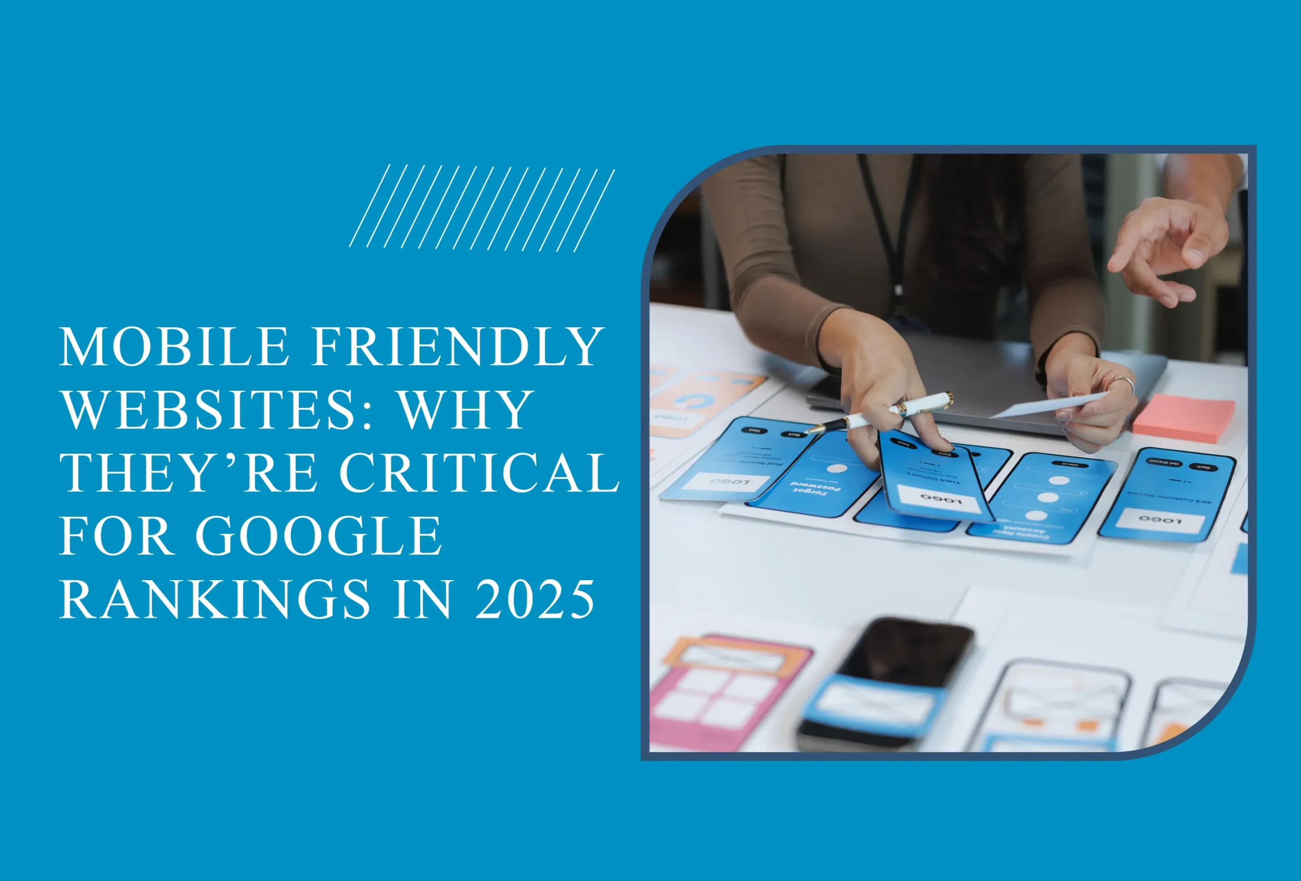
Introduction
By 2025, more than 75% of global internet users access websites through mobile devices. This reality raises a vital question for businesses:
👉 Is your website mobile-friendly?
With Google’s mobile-first indexing, the mobile version of your website is now the primary factor in determining search rankings. In other words, mobile-friendliness is no longer optional — it’s a critical ranking factor for SEO and a key driver of user experience and conversions.
What Is a Mobile-Friendly Website?
A mobile-friendly (responsive) website automatically adapts its layout to fit different screen sizes.
- On desktops, it offers a wide display.
- On tablets, it reorganizes content for readability.
- On phones, it provides an easy-to-navigate, scroll-free experience.
👉 In short, a mobile-friendly site ensures visitors enjoy a seamless experience across all devices.
Why Mobile-Friendliness Matters to Google
Since 2018, Google has implemented mobile-first indexing, meaning the mobile version of your website is indexed first.
- Non-mobile-friendly websites → drop in search rankings.
- Mobile-optimized websites → improved SEO performance and better user experience.
💡 Case Study: A Turkish SME updated its website to a mobile-friendly design in 2024. Within 3 months:
- It climbed 2 pages higher in Google rankings.
- Bounce rate dropped by 18%.
- Sales from organic traffic increased by 25%.
The Global vs Local Perspective
- Worldwide: Mobile-friendliness is standard. In the US and Europe, almost no professional websites remain non-responsive.
- Turkey & Developing Markets: Many SMEs still lack mobile-friendly websites. This creates a competitive advantage for those who invest in responsive design.
- Bottom line: In 2025, being mobile-friendly is not just a trend — it’s an opportunity to outperform competitors.
Key Benefits of a Mobile-Friendly Website
- Boosts SEO Performance
- Mobile-friendly websites rank higher on Google.
- Faster loading speeds reduce bounce rates.
- Enhances User Experience
- Visitors stay longer and view more pages.
- Contact and conversion rates increase.
- Drives Sales and Conversions
- E-commerce websites see up to a 30% sales increase after mobile optimization.
- Mobile users make faster purchase decisions.
- Creates Competitive Advantage
- If your competitors are not mobile-ready, you’ll instantly gain market share.
How to Test Your Website’s Mobile-Friendliness
- Google Mobile-Friendly Test: Instantly checks if your site is optimized.
- Google PageSpeed Insights: Provides detailed mobile performance reports.
- Real Device Testing: Always test your website on different screen sizes and devices.
If your site loads slowly or requires excessive zooming, it’s time to upgrade with a professional web design service.
Cost of Mobile-Friendly Design in 2025
- Template-Based Websites: Usually come with mobile-friendly layouts by default.
- Custom Designs: Fully tailored responsive solutions for your brand.
- Estimated Cost: In 2025, mobile optimization is a major factor shaping overall web design prices.
Frequently Asked Questions
1. How do I know if my website is mobile-friendly?
Use Google’s Mobile-Friendly Test for a quick check.
2. Does mobile-friendliness really affect SEO?
Yes. Google has confirmed mobile-friendliness is a direct ranking factor.
3. Do I need a complete redesign for mobile optimization?
Sometimes. Modern templates may only need minor adjustments, but older websites often require a full redesign.
4. Is mobile-friendliness only about design?
No. Site speed, image optimization, and content structure are equally important.
5. Should I implement AMP?
AMP (Accelerated Mobile Pages) can help news and content-heavy sites, but for most businesses, a responsive design is enough.
Conclusion
In 2025, a mobile-friendly website is non-negotiable.
- For SEO: Higher Google rankings
- For users: Better experience and engagement
- For business: Increased sales and conversions
To ensure your website is mobile-ready and SEO-optimized, explore our professional web design services.